arc-text
更新时间:
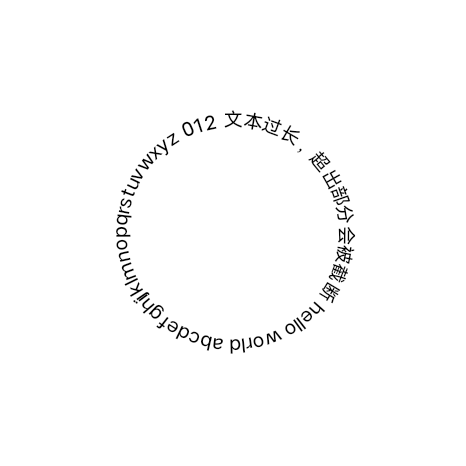
弧形文本,文本内容展示在 arc-text 组件盒模型内最大且居中的圆周上,超出的内容将会被截断。
如下图示例
弧
形
文
本
子组件
不支持
属性
支持通用属性
样式
支持通用样式
| 名称 | 类型 | 默认值 | 必填 | 描述 |
|---|---|---|---|---|
| color | <color> |
#000000 | 否 | 文本颜色 |
| font-size | <length> |
30px | 否 | 文本尺寸 |
| font-weight | normal | bold | lighter | border | <number> |
normal | 否 | 当前平台仅支持 normal 与 bold 两种效果 |
| direction | clockwise | counterclockwise | clockwise | 否 | 文本绘制方向,clockwise 顺时针方向,counterclockwise 逆时针方向。 |
| start-angle | <deg> |
0deg | 否 | 文本绘制起始角度,以时钟 0 点为基线,取值范围为 0 到 360。 |
事件
支持通用事件
arc-text组件示例
基础用法
<template>
  <div class="wrapper">
    <div class="text-container">
      <arc-text>{{ content }}</arc-text>
    </div>
  </div>
</template>

<script>
export default {
  data() {
    return {
      content:
        '文本过长,超出部分会被截断 hello world abcdefghijklmnopqrstuvwxyz 0123456789'
    }
  }
}
</script>

<style>
.wrapper {
  flex-direction: column;
  align-items: center;
  justify-content: center;
}
.text-container {
  margin: 40px;
  width: 400px;
  height: 400px;
  flex-direction: column;
}
</style>
复制代码