vw-button
更新时间:
一种基础的组件,点击后可执行对应(按钮表意)的操作。包含“文字按钮”“图标按钮”两类;
属性
| 名称 | 类型 | 默认值 | 必填 | 描述 |
|---|---|---|---|---|
| type | <string> |
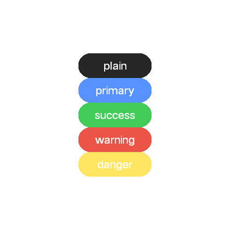
plain | 否 | 类型包括以下五种类型: plain,primary,success,warning,danger |
| value | <string> |
- | 是 | 按钮文本 |
| disabled | <boolean> |
false | 否 | 按钮禁用状态 |
| color | <string> |
- | 否 | 文字颜色 |
| bg-color | <string> |
- | 否 | 按钮颜色 |
| text-size | <string> |
- | 否 | 文本字号 |
事件
| 名称 | 参数 | 描述 |
|---|---|---|
| click | MouseEvent | 组件被点击时触发 |
vw-button公共组件
一种基础的组件
基础用法
<script>
export default {}
</script>

<template>
  <div class="flex flex-col justify-center items-center bg-white">
    <vw-button type="plain" value="plain"></vw-button>
    <vw-button type="primary" value="primary"></vw-button>
    <vw-button type="success" value="success"></vw-button>
    <vw-button type="warning" value="warning"></vw-button>
    <vw-button type="danger" value="danger"></vw-button>
  </div>
</template>

<style>
@tailwind utilities;
</style>
复制代码