input
更新时间:
提供可交互的界面,接收用户的输入,默认为单行
子组件
不支持
属性
支持通用属性
| 名称 | 类型 | 默认值 | 必填 | 描述 |
|---|---|---|---|---|
| type | button | checkbox | radio | text | date | speak | text | 否 | 支持动态修改,text 为输入法录入, speak 为语音录入 |
| checked | <boolean> |
false | 否 | 当前组件的 checked 状态,可触发 checked 伪类,type 为 checkbox 时生效 |
| name | <string> |
- | 否 | input 组件名称 |
| value | <string> |
- | 否 | input 组件的值 |
| placeholder | <string> |
- | 否 | 提示文本的内容,type 为 text | date | speak 时生效 |
样式
支持通用样式
| 名称 | 类型 | 默认值 | 必填 | 描述 |
|---|---|---|---|---|
| color | <color> |
#000 | 否 | 文本颜色 |
| caret-color | <color> |
#000 | 否 | 光标颜色 |
| font-size | <length> |
43.2px | 否 | 文本尺寸 |
| text-decoration | <string> |
underline | 否 | 文本下划线,目前只支持 underline |
| placeholder-color | <color> |
#000 | 否 | 提示文本的颜色,type 为 text | date | speak 时生效 |
| width | <length> | <percentage> |
- | 否 | 组件宽度 |
| height | <length> | <percentage> |
- | 否 | 组件高度 |
事件
支持通用事件
| 名称 | 参数 | 描述 |
|---|---|---|
| change | 不同 type 参数不同,具体见下方 change 事件参数 | input 组件的值、状态发生改变时触发,type 为 button 时无 change 事件 |
| focus | index | 获取光标返回的下标值 |
change 事件参数
| 参数 | text | speak | checkbox | radio | 备注 |
|---|---|---|---|---|
| name | √ | √ | ||
| value | √ | √ | √ | |
| checked | √ |
方法
| 名称 | 参数 | 描述 |
|---|---|---|
| setSpan | Object | 动态设置文字样式,方法的入参不是必填项 目前只支持设置 color 和 text-decoration |
| focus | 无 | type 为 text | speak 时 生效。speak 可拉起语音输入,text 可拉起文字输入法 |
setSpan 参数说明如下:
| 属性 | 类型 | 默认值 | 描述 |
|---|---|---|---|
| start | Number | - | 指定开始的位置 |
| end | Number | - | 指定结束的位置 |
| style | Object | - | 设置文字样式 ,不设置样式默认组件本身的样式 |
示例
<template>
    <div style="flex-direction:column;">
       <input id="input" value="{{value}}" onfocus="focus"></input>
    </div>
    <div onclick="setSpan">设置文字样式</div>
</template>

<script>
  export default {
    data:{
      value:'input'
    },

    //组件获取光标后的回调值,在对应的位置插入值
    focus(index){

       //把输入框的值转为数组
       let data = String(this.value).split('')

       //在对应的位置插入对应的值
       data.splice(index,0,'插入input的值')

       //把转换后的值赋值回去给input组件的value
       this.value = data.join('');
    },

    setSpan(){
       //设置文字样式
       this.$element('input').setSpan({
          start:0,
          end:10,
          style:{
            'text-decoration':'underline',
            'color':'#000'
          }
       });
    }
  }
</script>
复制代码
示例
修改 checkbox 组件的颜色
<template>
    <div style="flex-direction:column;">
       <input checked="{{checked}}"  color='#a52a2a'  type='checkbox'></input>
    </div>
</template>

<script>
  export default {
     data:{
       checked:true
     }
  }
</script>
复制代码
示例
修改 radio 组件的颜色
<template>
    <div style="flex-direction:column;">
       <input checked="{{checked}}"  color="#399FFF"  type="radio"> </input>
    </div>
</template>

<script>
  export default {
     data:{
       checked:true
     }
  }
</script>
复制代码
input组件示例
按钮
<template>
  <div class="wrapper">
    <input type="button" class="button" value="primary" />
    <input type="button" class="button danger" value="danger" />
  </div>
</template>

<script>
export default {}
</script>

<style>
.wrapper {
  flex-direction: column;
  align-items: center;
  justify-content: center;
}
.button {
  width: 400px;
  height: 80px;
  align-items: center;
  color: #ffffff;
  background-color: #1890ff;
  border-radius: 15px;
}
.danger {
  margin-top: 10px;
  background-color: #ff7875;
}
</style>
复制代码


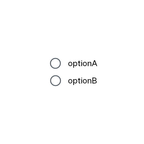
多选框
<template>
  <div class="wrapper">
    <div class="checkbox-row">
      <input name="option" id="optionA" type="checkbox" value="optionA" />
      <label class="label" target="optionA">optionA</label>
    </div>
    <div class="checkbox-row">
      <input name="option" id="optionB" type="checkbox" value="optionB" />
      <label class="label" target="optionB">optionB</label>
    </div>
  </div>
</template>

<script>
export default {}
</script>

<style>
.wrapper {
  align-items: center;
  justify-content: center;
  flex-direction: column;
}
.checkbox-row {
  justify-content: flex-start;
}
.label {
  margin-left: 20px;
  font-size: 40px;
}
</style>
复制代码

单选框
<template>
  <div class="wrapper">
    <div class="radio-row">
      <input name="option" id="optionA" type="radio" value="optionA" />
      <label class="label" target="optionA">optionA</label>
    </div>
    <div class="radio-row">
      <input name="option" id="optionB" type="radio" value="optionB" />
      <label class="label" target="optionB">optionB</label>
    </div>
  </div>
</template>

<script>
export default {}
</script>

<style>
.wrapper {
  align-items: center;
  justify-content: center;
  flex-direction: column;
}
.radio-row {
  justify-content: flex-start;
}
.label {
  margin-left: 20px;
  font-size: 40px;
}
</style>
复制代码
文本输入框
<template>
  <div class="wrapper">
    <input type="text" class="input-text" placeholder="Basic usage" />
  </div>
</template>

<script>
export default {}
</script>

<style>
.wrapper {
  flex-direction: column;
  align-items: center;
  justify-content: center;
}
.input-text {
  width: 500px;
  height: 80px;
  border: 1px solid #000;
  border-radius: 10px;
  padding-left: 20px;
}
</style>
复制代码
