progress
更新时间:
进度条,不支持子组件,支持通用事件
属性
支持通用属性
| 名称 | 类型 | 默认值 | 必填 | 描述 |
|---|---|---|---|---|
| percent | <number> |
0 | 否 | 当前进度 |
| type | horizontal | arc | horizontal | 否 | 进度条类型,不支持动态修改 |
样式
支持通用样式
horizontal progress 底色为(136, 136, 136)
arc progress 默认宽高为 32px,宽高设置不一致时,arc 图标为宽高的较小值
| 名称 | 类型 | 默认值 | 必填 | 描述 |
|---|---|---|---|---|
| color | <color> |
#33b4ff |
否 | 进度条的颜色 |
| stroke-width | <length> |
32px | 否 | 进度条的宽度 |
background-color deprecated |
<color> |
#f0f0f0 |
否 | 进度条的背景颜色,该属性已经废弃,仅手表设备有支持 |
| layer-color | <color> |
#f0f0f0 |
否 | 进度条的背景颜色 |
| start-angle | <deg> |
- | 否 | 弧形进度条起始角度,以时钟 0 点为基线,取值范围为 0 到 360(顺时针)。 |
| total-angle | <deg> |
- | 否 | 弧形进度条总长度,范围为-360 到 360,负数标识起点到终点为逆时针。 |
方法
| 名称 | 参数 | 描述 |
|---|---|---|
| progressTo | Object | 设置进度条到指定进度 |
progressTo 的参数说明:
| 名称 | 类型 | 是否必选 | 默认值 | 备注 |
|---|---|---|---|---|
| progress | Number | 是 | 无 | 进度条的目标进度 |
| foreground | <color> |
否 | 无 | 进度条的目标颜色 |
| background | <color> |
否 | 无 | 进度条背景的目标颜色 |
| duration | Number | 否 | 500 | 动画持续时间,单位为 ms |
| timingFunction | String | 否 | ease | 绘制进度条的动画速度曲线,支持 linear |ease |ease-in |ease-out | ease-in-out |cubic-bezier(<number>, <number>, <number>, <number>) |
timingFunction 说明
| 值 | 说明 |
|---|---|
| linear | 表示动画以匀速运动 |
| ease | 表示动画在中间加速,在结束时减速 |
| ease-in | 表示动画一开始较慢,随着动画属性的变化逐渐加速,直至完成 |
| ease-out | 表示动画一开始较快,随着动画的进行逐渐减速 |
| ease-in-out | 表示动画属性一开始缓慢变化,随后加速变化,最后再次减速变化 |
| cubic-bezier(<number>, <number>, <number>, <number>) | 开发者自定义的三次贝塞尔曲线,其中第一位参数和第三位参数的值必须在 0 到 1 的范围内 |
progress组件
进度条
弧形进度条
<script>
export default {}
</script>

<template>
  <div class="flex flex-col justify-center items-center bg-white">
    <progress class="w-[300px] h-[300px]" type="arc" percent="50"></progress>
  </div>
</template>

<style>
@tailwind utilities;
</style>
复制代码


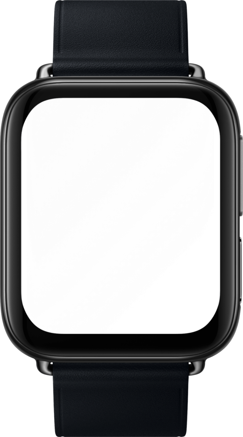
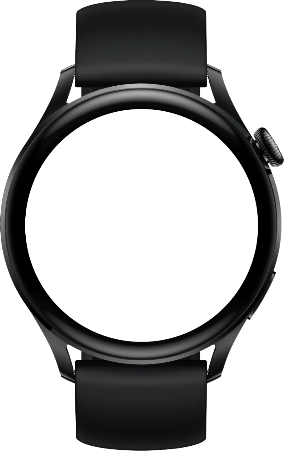

弧形-更多演示
<script>
export default {
  data() {
    return {
      percent: 0,
      Interval: ''
    }
  },
  onShow() {
    this.interval = setInterval(() => {
      this.percent += 10
      if (this.percent === 100) clearInterval(this.interval)
    }, 1000)
  },
  onHide() {
    clearInterval(this.interval)
  }
}
</script>

<template>
  <div class="flex flex-col justify-center items-center bg-white">
    <div class="flex flex-col justify-center items-center m-5">
      <progress
        type="arc"
        percent="{{ percent }}"
        class="w-[200px] h-[200px] stroke-[24px] start-angle-[0deg] total-angle-[360deg] bg-[#f5f5f5] {{ percent < 100 ? 'text-[#1890ff]' : 'text-[#52c41a]' }}"
      ></progress>
      <text if="{{ percent < 100 }}" class="text-[40px]">{{ percent }}%</text>
      <image else class="w-[100px] object-contain" src="/assets/images/success.png"></image>
    </div>
    <div class="flex flex-col justify-center items-center m-5">
      <progress
        type="arc"
        percent="50"
        class="w-[200px] h-[200px] stroke-[24px] start-angle-[0deg] total-angle-[360deg] bg-[#f5f5f5] text-[#ff4d4f]"
      ></progress>
      <image class="w-[100px] object-contain" src="/assets/images/exception.png"></image>
    </div>
  </div>
</template>

<style>
@tailwind utilities;
.progress-arc {
  start-angle: 0deg;
  total-angle: 360deg;
}
</style>
复制代码
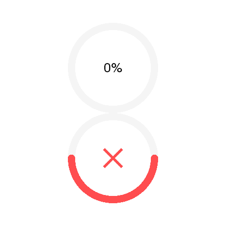
基础用法
<script>
export default {}
</script>

<template>
  <div class="flex flex-col justify-center items-center bg-white">
    <progress class="w-[300px] h-[50px]" percent="50"></progress>
  </div>
</template>

<style>
@tailwind utilities;
</style>
复制代码

条形-更多演示
<script>
export default {
  data() {
    return {
      percent: 0,
      Interval: ''
    }
  },
  onShow() {
    this.interval = setInterval(() => {
      this.percent += 10
      if (this.percent === 100) clearInterval(this.interval)
    }, 1000)
  },
  onHide() {
    clearInterval(this.interval)
  }
}
</script>

<template>
  <div class="flex flex-col justify-center items-center p-5">
    <div class="w-[450px] h-[100px] flex items-center justify-between">
      <stack class="flex pl-10 items-center">
        <progress
          percent="{{ percent }}"
          class="w-[300px] h-[50px] stroke-[40px] bg-[#f5f5f5] {{ percent < 100 ? 'text-[#1890ff]' : 'text-[#52c41a]' }}"
        ></progress>
        <text class="text-[36px] h-[50px] text-white pl-[20px]">{{ percent }}%</text>
      </stack>
      <image
        if="{{ percent === 100 }}"
        class="w-[50px] object-contain"
        src="/assets/images/success-round.png"
      ></image>
    </div>
    <div class="w-[450px] h-[100px] flex pl-10">
      <progress percent="50" class="w-[300px] h-[50px] stroke-[40px] bg-[#f5f5f5] text-[#ff4d4f]"></progress>
      <image class="w-[50px] object-contain ml-5" src="/assets/images/exception-round.png"></image>
    </div>
  </div>
</template>

<style>
@tailwind utilities;
</style>
复制代码
