label
更新时间:
为 input 组件定义标注
子组件
不支持
属性
支持通用属性
| 名称 | 类型 | 默认值 | 必填 | 描述 |
|---|---|---|---|---|
| target | <string> |
- | 否 | 目标 input 组件 id |
样式
支持通用样式
支持text 样式
事件
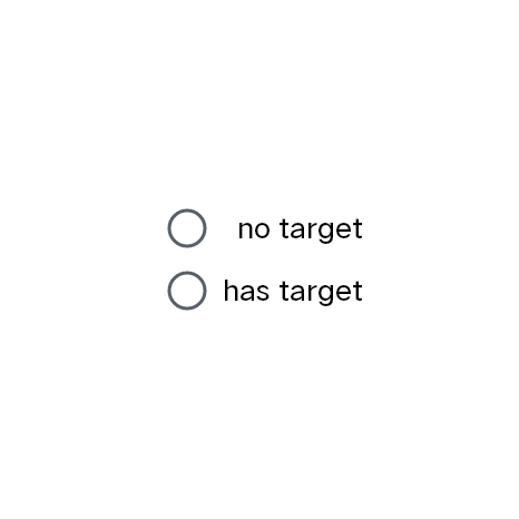
点击 label 组件,触发 target 绑定 id 的 checkbox 或者 radio 组件点击事件,扩大点击范围
label组件示例
基础用法
<template>
  <div class="wrapper">
    <div class="radio-row">
      <input name="option" id="optionA" type="radio" value="optionA" />
      <label class="label">no target</label>
    </div>
    <div class="radio-row">
      <input name="option" id="optionB" type="radio" value="optionB" />
      <label class="label" target="optionB">has target</label>
    </div>
  </div>
</template>

<script>
export default {}
</script>

<style>
.wrapper {
  align-items: center;
  justify-content: center;
  flex-direction: column;
}
.radio-row {
  justify-content: space-between;
  width: 300px;
}
.label {
  font-size: 40px;
}
</style>
复制代码