div
更新时间:
基本容器,支持子组件,支持通用属性,支持通用样式,支持通用事件
样式
| 名称 | 类型 | 默认值 | 必填 | 描述 |
|---|---|---|---|---|
| flex-direction | column | row | column-reverse | row-reverse | row | 否 | 默认为横向 row,父容器为<div>、<list-item>时生效 |
| flex-wrap | nowrap | wrap | wrap-reverse | nowrap | 否 | 规定 flex 容器是单行或者多行,同时横轴的方向决定了新行堆叠的方向 |
| justify-content | flex-start | flex-end | center | space-between | space-around | flex-start | 否 | 设置或检索弹性盒子元素在主轴(横轴)方向上的对齐方式 |
| align-items | stretch | flex-start | flex-end | center | stretch | 否 | 定义 flex 子项在 flex 容器的当前行的侧轴(纵轴)方向上的对齐方式 |
| align-content | stretch | flex-start | flex-end | center | space-between | space-around | stretch | 否 | 属性在弹性容器内的各项没有占用交叉轴上所有可用的空间时对齐容器内的各项(垂直),容器内必须有多行的项目,该属性才能渲染出效果 |
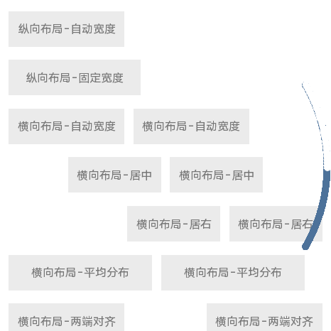
div组件示例
更多布局示例
<template>
  <div class="wrapper">
    <div class="wrap-column">
      <text class="text">纵向布局-自动宽度</text>
      <text class="text fixed-width-300">纵向布局-固定宽度</text>
    </div>
    <div class="wrap-row">
      <text class="text">横向布局-自动宽度</text>
      <text class="text">横向布局-自动宽度</text>
    </div>
    <div class="wrap-row vw vertical-center">
      <text class="text">横向布局-居中</text>
      <text class="text">横向布局-居中</text>
    </div>
    <div class="wrap-row vw vertical-right">
      <text class="text">横向布局-居右</text>
      <text class="text">横向布局-居右</text>
    </div>
    <div class="wrap-row vw">
      <text class="text flex-1">横向布局-平均分布</text>
      <text class="text flex-1">横向布局-平均分布</text>
    </div>
    <div class="wrap-row vw space-between">
      <text class="text">横向布局-两端对齐</text>
      <text class="text">横向布局-两端对齐</text>
    </div>
    <div class="wrap-row">
      <text class="text fixed-width-200">固定宽度</text>
      <text class="text flex-1">自动占满余量</text>
    </div>
    <div class="wrap-row vw">
      <text class="text fixed-width-200">固定宽度</text>
      <text class="text flex-1">自动占满</text>
      <text class="text fixed-width-200">固定宽度</text>
    </div>
    <div class="wrap-row vw flex-wrap">
      <text class="text fixed-width-280">一行显示不全,wrap折行</text>
      <text class="text fixed-width-280">一行显示不全,wrap折行</text>
      <text class="text fixed-width-280">一行显示不全,wrap折行</text>
    </div>
    <div class="wrap-row">
      <div class="text-row text-row-item flex-1 align-start">
        <text class="text">垂直居顶</text>
      </div>
      <div class="text-row text-row-item flex-1 align-center">
        <text class="text">垂直居中</text>
      </div>
      <div class="text-row text-row-item flex-1 align-end">
        <text class="text">垂直居底</text>
      </div>
    </div>
  </div>
</template>

<script>
export default {}
</script>

<style>
.wrapper {
  flex-direction: column;
  align-items: flex-start;
  padding: 10px;
}
.vw {
  width: 100%;
}
.flex-1 {
  flex: 1;
}
.text {
  margin: 15px 10px;
  padding: 0 20px;
  background-color: #ebebeb;
  height: 80px;
  text-align: center;
  color: #777;
  font-size: 26px;
}
.wrap-column {
  flex-direction: column;
}
.text-row {
  background-color: #ebebeb;
  text-align: center;
  margin: 15px 10px;
}
.fixed-width-300 {
  width: 300px;
}
.fixed-width-200 {
  width: 200px;
}
.fixed-width-280 {
  width: 280px;
}
.vertical-center {
  justify-content: center;
  align-items: center;
}
.vertical-right {
  justify-content: flex-end;
}
.space-between {
  justify-content: space-between;
}
.flex-wrap {
  flex-wrap: wrap;
}
.text-row-item {
  height: 200px;
  justify-content: center;
}
.align-start {
  align-items: flex-start;
}
.align-end {
  align-items: flex-end;
}
.align-center {
  align-items: center;
}
</style>
复制代码


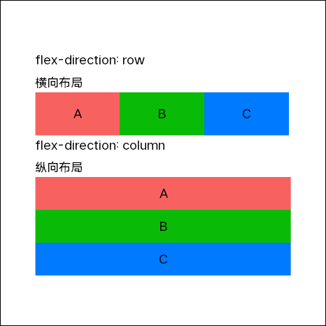
基本布局示例
<template>
  <div class="wrapper">
    <div class="flex-direction">
      <text>flex-direction: row</text>
    </div>
    <div>
      <text>横向布局</text>
    </div>
    <div class="horizontal">
      <div class="horizontal-wrap color-1">
        <text>A</text>
      </div>
      <div class="horizontal-wrap color-2">
        <text>B</text>
      </div>
      <div class="horizontal-wrap color-3">
        <text>C</text>
      </div>
    </div>
    <div class="flex-direction">
      <text>flex-direction: column</text>
    </div>
    <div>
      <text>纵向布局</text>
    </div>
    <div class="vertical">
      <div class="vertical-wrap color-1">
        <text>A</text>
      </div>
      <div class="vertical-wrap color-2">
        <text>B</text>
      </div>
      <div class="vertical-wrap color-3">
        <text>C</text>
      </div>
    </div>
  </div>
</template>

<script>
export default {}
</script>

<style>
.wrapper {
  width: 466px;
  flex-direction: column;
  align-items: flex-start;
  padding: 10px 80px;
  justify-content: center;
  border: 1px solid #000;
}
text {
  font-size: 28px;
}
.flex-direction {
  margin-bottom: 10px;
}
.vertical {
  flex-direction: column;
}
.vertical-wrap {
  width: 366px;
  height: 75px;
  justify-content: center;
  align-items: center;
}
.horizontal-wrap {
  width: 195px;
  height: 100px;
  justify-content: center;
  align-items: center;
}
.color-1 {
  background-color: #f76260;
}
.color-2 {
  background-color: #09bb07;
}
.color-3 {
  background-color: #007aff;
}
</style>
复制代码